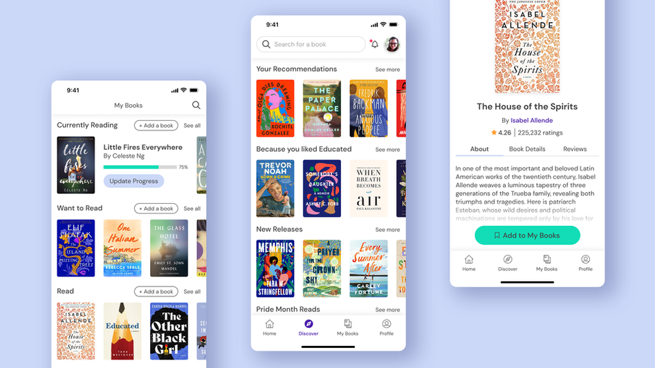
How might we design a tool that helps enhance a user’s enjoyment of reading?
Team
Me - UX/UI Designer
Dan Silveira - Mentor
Timeline
10 weeks
Responsibilities
UX Research, Ideation, Information Architecture, Wireframing, Protoyping, Usability Testing, UI Design
Tools
Figma, Illustrator
Project Overview
I love to read! I read every day and I love telling my friends about what I’m reading. It’s one of my favourite hobbies. I keep track of my book list on the app Goodreads, but I find that it’s a pain to use, and I wish there was something better. And after asking some of my friends, it turns out they have frustrations with Goodreads too, and they only use it because there are no better alternatives.
Problem Space
Avid readers want an easy way to digitally keep track of their book list and find relevant book recommendations so that they can find their next favourite book and accomplish their reading goals.
My idea was to design an app that serves as your own digital bookshelf: an app that keeps your books organized, gives you personalized recommendations, and is an outlet for sharing books with your friends, all in a clean and easy-to-navigate app. Think Goodreads but more streamlined: less bloat, more emphasis on features that users really want.
User Discovery
My first step was to get to know my target users. I reached out to 5 individuals aged 25-45 who love to read and who also use reading apps such as Goodreads and Overdrive. I asked them a series of questions about their general reading habits and how they use apps and websites to find new books to read.
What are you currently reading, and how did you hear about this book?
What resources do you consult before you read a book, and why?
Why do you like to read? What are your main reading goals?
Describe a time when you used an app or website to look for book recommendations.
What features do you like about this app? What frustrations do you have with it?
What features do you look for in a reading app?
Themes & Insights
While analyzing my data, I recognized a few themes emerging and proceeded to group my data into categories. I learned about their various motivations for reading and what resources they use when searching for books. I discovered that they place a lot of trust in reviews as well as favourite authors. The social aspect of reading came up a lot; a major source of their recommendations come from friends and family. I also gained insight on how users like to organize their books, and their pain points with the apps they’re using currently. Lastly, I discovered that mobile was the most commonly used platform, so I decided to take a mobile-first approach to my design.

Key Insights
A user is most likely to pick up a book if it was recommended by a friend, has high ratings, or is by an author they’ve read before.
With these insights in mind, I believe that users would benefit most from:
-
a reading-focused social media feature so they can interact with their friends
-
average ratings and reviews at a glance
-
“more books by this author” lists
I also believe users would benefit from automatic category filters to make sorting their books less time-consuming. I want to make a user’s digital library a fun place to hang out in, and not a chore to maintain.
Personas
I put a human face to my data by formulating 2 different personas that would represent the typical users of my app. These 2 personas helped guide my design decisions by keeping their “needs” in mind.


Information Architecture
The information architecture of my app consists of 4 main sections. The first one is the Home screen where you’ll see your news feed. Next is the My Books page, which is your own personal catalogue of books you’re reading, have read, and want to read. Next is the Discover page which uses an algorithm to give you personalized recommendations, like “if you liked this book, you’ll also enjoy these.” Lastly is the Profile section where you can view your public profile, reading challenges, and friends list.
The Book Detail page is also an important section which can be accessed from many different screens similar to a social media-style web structure. For simplicity, I nested it within the Search section of the Home screen.
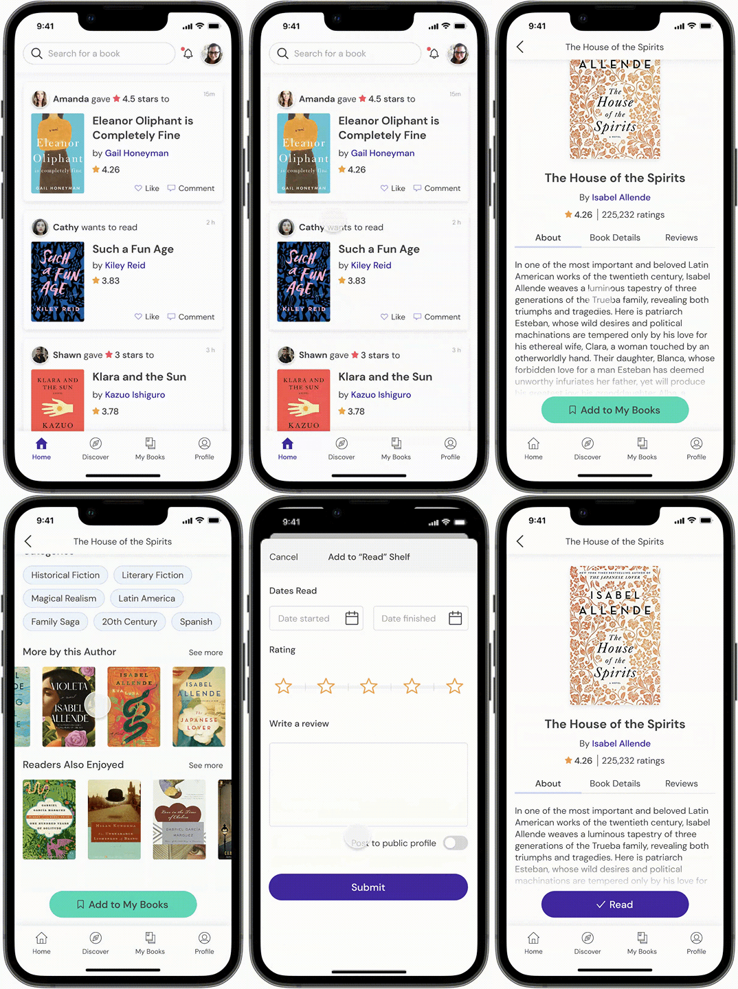
I also mapped out two user flows that I wanted to focus on for my protoype, seen below.

User Flow #1
Search for a specific book and add it to your shelf.

User Flow #2
Filter your book list by a specific genre.

Sketches
In my sketching phase, I explored several ways of laying out the book detail page, where all the book information will be. I came up with the idea of having 2 CTA buttons: “Want to Read” and “Not Interested”. I thought it would be fun to make a “Tinder for books” where you can swipe right or left on a book and the algorithm will learn from your preferences to suggest more books you’ll like.
Also shown below are my sketches for task flow #2 where I explored different ways of showing the filtering interaction.

Wireframes
User Flow #1
Search for a specific book and add it to your shelf.

User Flow #2
Filter your book list by a specific genre.

Discover Mode
Swipe through your personalized feed of book recommendations.

User Testing
I tested out my low-fidelity protoype at this stage, and found that I needed to change a few things!
Across the board, testers did not understand what the bookmark icon meant so they were confused about how to add books. I abandoned the 2-in-1 button and made an entirely separate button for additional options.

Next I discovered that users often went directly to the My Books screen if they wanted to add a book, rather than using the search bar on the home screen or discover screen. This was a clue for me to add an “add books” button here so you can achieve the same task in several ways.

Users also didn’t notice the filter icon in the top right corner of the Book List screen, and they often clicked on the sort button if they wanted to filter. This taught me that even though filtering and sorting are 2 separate functions, users often think they are the same thing. In the next iteration of this screen, I combined the sort and filter functions to reduce confusion. This effectively combined 2 screens into one: you can now sort your books AND filter them in one place.


UI Design
Moodboard
For my UI design, I took inspiration from, well… books! Books are beautiful, and they are colourful, and I wanted the book covers to take centre stage. Below you will see my moodboard featuring bold illustrated book covers and bright, clean UI designs.

Style Guidelines
I went for a minimalistic design with one primary colour plus a neutral grey, and then I used pops of colour sparingly for specific elements such as CTA buttons and star ratings.

Learning Outcomes
-
One of the things I struggled with was my project scope, and I found that developing personas helped a lot with narrowing down my focus and determine what was most important.
-
Usability testing helped me develop more empathy for my users because I got to see that something that makes sense for me won’t always make sense for others!
-
I really enjoyed protoyping and would like to explore more advanced protoyping programs in the future.
-
Given more time, I would like to develop more user flows such as adding a comment to a friend’s review, updating your reading progress on a book, and even building out author and user profile pages. I would also like to explore onboarding flows for when a user first signs up and starts to build their library. I also think there's an opportunity to sprinkle in some charming illustrations to the UI to make the user experience more delightful.


