A vibrant new visual identity for a rewards program to resonate with all Canadians.
Team
Me - Designer
Marianne Louw- ACD
Eric Ramirez - Strategy
Karen Jorritsma - Designer
Dave Savoie - Copywriter
Timeline
1 year
Responsibilities
Brand Design, Illustration
Tools
Figma, Photoshop, Illustrator
Project Overview
In a world that’s inundated with choices, Avion Rewards stands out as more than just a loyalty program: it is a curator of moments, a catalyst for experiences and a companion for consumers. We were approached by RBC with the challenge of bringing to life a new visual identity as they evolve to truly stand out as a lifestyle brand.
There were several major guardrails in place: we were not to change the main logo, core colour palette or existing typefaces. More of an evolution than a revolution, we took inspiration from the Avion Rewards "Shield Waves" – an existing brand asset derived from the shield shape in the RBC logo – to create a brand new logo lockup that brings vibrancy and movement to the brand and a fresh take on the established brand colours.

Since Avion Rewards is a digital-first brand, it was important to have consistency with logo usage across many types of digital specs. After rigorous pressure-testing, we established a simple sizing calculation that achieves similar weighting to the logo lockup at any size. We also developed a secondary logo lockup that lives in the top-left corner of the canvas for any digital applications (ie. Instagram Reels) where the primary logo lockup would be covered by UI overlays.

Colour Palette and Web Accessibility
The Avion Rewards primary colour palette consists of four core colours, retained from the existing branding. The primary colours are used within the main brand graphic asset, the Shield Waves.
We also retained two existing colours as secondary colours: Navy Blue and Cool White. Navy Blue is used for typography, the standalone logo (in its positive state) and backgrounds. Cool White is reserved for backgrounds.
We also introduced two highlight colours to the secondary palette: Sunburst and Sunset. These vibrant hues are used to infuse a pop of colour, contrasting with the primarily blue palette.
We worked closely with the RBC Digital team to create a colourful tertiary colour palette which is reserved for enhancing the digital experience through UI elements such as iconography and snipes. We also created detailed guidelines on how to use the brand colours in a way that meets WCAG accessiblity standards.
Illustration & Iconography System
A key component of the Avion Rewards brand refresh was the development of a cohesive illustration and iconography system– something that did not exist in the old visual identity. The system needed to be modular, scalable, and flexible enough to use in both the digital experience and in external communications, working in harmony with the Shield Waves in layout and depicting the concept of online shopping, earning points/cash back, and redeeming rewards.
We explored several illustration approaches: flat shapes with outlines, isometric vectors, and 3D rendered illustrations. The client gravitated toward the isometric style, so we proceeded to flesh out the stylistic details, pressure testing it in example layouts and injecting brand equity through the use of Shield Waves and the RBC Bright Blue colour.

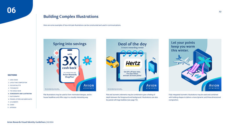
Below is the moodboard for the selected illustration style. Characterized by its simplicity and depth, this style features geometric, flat shapes augmented by added isometric elements, resulting in a visually engaging aesthetic that is easy to replicate and scale to more complex illustrations.

The final illustration system, shown in the style guide exerpt below, contains 4 tiers ranging from simple functional icons to more complex isometric illustrations. The colour palette is deliberately limited, with RBC Bright Blue serving as the unifying element throughout, enhancing brand recognition and consistency. By incorporating the Shield Wave as a recurring pattern in all illustrations, the style achieves a high level of cohesion and uniqueness specific to Avion Rewards. This approach not only brings simplicity and boldness to the brand but also ensures a memorable and ownable visual identity.
Promos, Offers and Merchants
A unique challenge with Avion Rewards is that many of the brand's communications centre around different merchants. With over 2,000 merchants connected to the rewards program, we needed to create an effective way to show offers and promotions featuring many merchants or even just a single merchant, all while integrating seamlessly with the Avion Rewards branding.
Previously, merchant logos were displayed inside circles. This system caused several problems: it often took up too much real estate in layouts, caused challenges achieving a balanced composition, and caused extreme horizontal logos to look too small inside the circles.
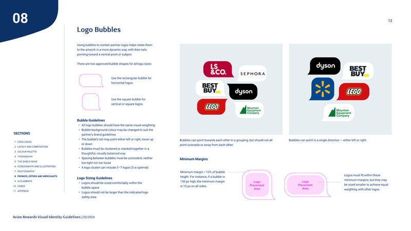
Our solution was to create a "speech bubble" shape to house merchant logos. Derived from the Shield Wave – the brand’s main graphic asset and distinctive visual connector – we created a unique graphic element that contributes to building brand equity through design repetition.

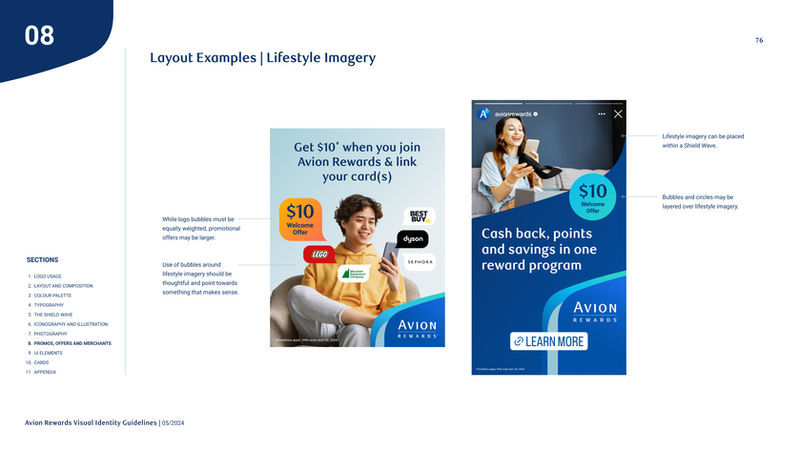
The rectangular and square variations of the bubbles enable all sizes of merchant logo – from extreme horizontal to vertical stacked logos – to be sized optimally and with equal weighting. The bubble "tails" can point towards each other or towards another element in the layout to create an implied connection and conversational quality to the creative. In the below style guide exerpt, you can see the versatility of the bubble shape and how the new brand assets come together to create impactful communication pieces.
Learning Outcomes
This was a challenging but very rewarding branding project! I feel that I emerged from this project a better designer, as I have honed my strategic problem-solving skills and become more intentional and brand-centric with every design decision. From extensive pressure-testing and exploration, I gained confidence in my design solutions and gained valuable communication skills through defending my rationales to stakeholders.


